Histograms and Cumulative Frequency for the ESAT
Updated July 2026
This guide explains how to construct and interpret diagrams for grouped discrete and continuous data. It covers histograms with unequal class intervals, the calculation of frequency density, and the use of cumulative frequency graphs to estimate the median and interquartile range. Mastery of these statistical tools is essential for analyzing data distributions in the ESAT.
The core principle of histograms is that frequency is represented by bar area, calculated via frequency density. Cumulative frequency graphs display running totals against upper class boundaries to facilitate the estimation of statistical measures such as the median and quartiles.
Discrete and continuous data
Data is classified into two main types: discrete and continuous. Understanding the difference is vital for selecting the correct representation. Discrete data can only take certain fixed values. For example, the number of pupils in a class must be an integer (you cannot have pupils). Other examples include the number of cars in a car park and UK shoe sizes, such as , , , and .
Continuous data can take on any value within a range. For instance, the heights of pupils in a class are continuous because a height could be cm. Even if measurements are rounded for recording purposes, the underlying data remains continuous.
Class intervals
When data is grouped, we use inequalities to express class intervals. These intervals must be continuous so that the upper boundary of one class is exactly the lower boundary of the next class. It is essential that every data point belongs to exactly one interval. Class intervals do not have to be of equal width.
There is a distinction between class limits and class boundaries. The class limits are the values written in a frequency table. The class boundaries are the 'true' values. For example, if heights are measured to the nearest cm and grouped as cm to cm, the class boundaries are . The lower boundary is the smallest number that rounds up to the lower limit, and the upper boundary is the smallest number that would round up to the next limit.
In a group of to cm, the limits are and , but the boundaries are and . If the next group is to cm, the class width is cm, showing that intervals can vary in width.
Histograms
Histograms are used to visualize the underlying shape of a data distribution, such as whether it is symmetrical, skewed, increasing, or decreasing. They follow specific rules:
- The area of the bar, not the height, is proportional to the frequency.
- Bar widths correspond to the class intervals (class width) and are bounded by the class boundaries.
- Bars are drawn on a continuous, linear, horizontal scale with no spaces between them unless a class has zero frequency.
- The vertical axis represents frequency density.
Frequency density is defined by the formula:
If the data is spread evenly on both sides of the centre, the distribution is described as symmetrical.
Cumulative frequency
Cumulative frequency curves plot running totals of data. They are used to make estimates of statistics such as the median, quartiles, and range. These curves can be used for both discrete and continuous data. The running total is always plotted against the upper class limit (or upper boundary). The resulting curve usually forms an elongated S shape. Points may be joined with a smooth curve or straight lines.
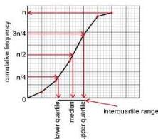
On the vertical axis, if the total frequency is , the median is the horizontal value corresponding to on the vertical axis. The lower quartile corresponds to and the upper quartile to . The interquartile range is the difference between these two horizontal values. On a graph of marks, a point shows that individuals achieved marks or fewer.
Worked Example: Discrete vs Continuous Data
Consider the following data sets:
- Length of a leaf: This is continuous because a leaf can take any value within a range.
- Number of insects caught in a trap: This is discrete because the count must be an integer.
- Mass of kittens: This is continuous because mass can take any value within a range.
Worked Example: Class Intervals for Continuous Data
Heights of tomato plants are measured to the nearest cm. We must determine the class boundaries.
| Class limits (cm) | Class interval (cm) |
|---|---|
| 50 to 59 | |
| 60 to 69 | |
| 70 to 79 | |
| 80 to 89 | |
| 90 to 109 |
Note that the upper boundary of the first class () becomes the lower boundary of the second class.
Worked Example: Drawing a Histogram
Using the plant data above, we calculate frequency density.
| Class interval | Frequency | Class width | Frequency density |
|---|---|---|---|
| 15 | 10 | ||
| 20 | 10 | ||
| 25 | 10 | ||
| 53 | 10 | ||
| 30 | 20 |
The histogram is drawn with frequency density on the vertical axis. If there is a large gap between and the first boundary, the axis can be compressed or start from the first boundary.
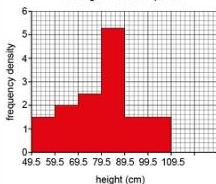
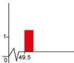
Alternatively, a zigzag line can show the scale compression:
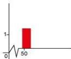
Or the bars can simply start at the relevant boundary on a linear scale:
Worked Example: Cumulative Frequency
We catch insects in 65 traps. We need to calculate cumulative frequency and estimate the median.
| Insects () | Class Interval | Freq | Cumulative Freq | Interval |
|---|---|---|---|---|
| 1 to 5 | 5 | 5 | ||
| 6 to 10 | 8 | 13 | ||
| 11 to 15 | 15 | 28 | ||
| 16 to 20 | 20 | 48 | ||
| 21 to 25 | 14 | 62 | ||
| 26 to 30 | 3 | 65 |
We plot cumulative frequency against upper limits (, , , etc.).
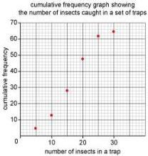
Join the points, starting from .
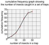
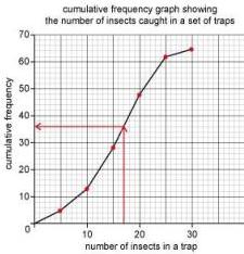
To find the median, divide the total () by to get . Read across from on the vertical axis to the curve, then down to the horizontal axis. The median is approximately .
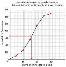
To find traps with more than insects: read up from on the horizontal axis to find on the vertical axis. This means traps have or fewer insects. Thus, traps have more than insects.
Key takeaways
- In histograms, the area of the bar is proportional to the frequency, not the height.
- Frequency density is calculated by dividing the frequency of a class by its width.
- Cumulative frequency is plotted against the upper class boundary of each interval.
- The median and quartiles can be estimated from a cumulative frequency graph by reading values at , , and .
- Discrete data takes specific values, while continuous data can take any value in a range.
Always double check your class widths before calculating frequency density. For histograms, if the class limits are to and to , the boundaries are , , and , making the width in both cases.
A common error is plotting cumulative frequency at the midpoint of the class. This is incorrect. Cumulative frequency represents the total 'up to' a certain point, so it must be plotted at the upper boundary.
The use of frequency density in histograms is a precursor to the concept of probability density functions in higher level statistics, where the total area under a curve represents a total probability of .
Frequently asked questions
Why do we use frequency density instead of frequency for histograms?
Frequency density is used so that the area of the bars represents the frequency. This allows us to compare classes with different widths accurately. If we used frequency as the height for unequal widths, the wider bars would incorrectly suggest a much larger proportion of the data.
Where exactly should I plot the points for a cumulative frequency graph?
You must plot the cumulative frequency against the upper boundary of the class interval. For example, if a class is , you plot the running total at .
How do I calculate the interquartile range from a cumulative frequency graph?
First, find the total frequency . Find the values on the horizontal axis corresponding to (lower quartile) and (upper quartile) on the vertical axis. Subtract the lower quartile value from the upper quartile value.
Do histogram bars always have to touch?
Yes, because histograms represent continuous data or data grouped into continuous intervals, the bars must touch. The only exception is if a class interval has a frequency of zero.