Statistics and Data Analysis for ESAT Mathematics 1
Updated July 2026
Mastering statistics is vital for the ESAT to interpret and compare data sets accurately. This guide covers calculating and estimating central tendency and spread for ungrouped and grouped data, interpreting graphical representations like histograms, and understanding the advantages and disadvantages of different summary values.
Statistics describe a population using measures of central tendency (mean, median, mode) and dispersion (range, interquartile range), requiring specific estimation techniques when data is grouped into intervals where exact values are unknown.
Mean, mode, median and range for ungrouped data
The mean, median, and mode are all types of averages used to describe the centre of a data set.
- The mean of a list of numbers is the sum of those numbers divided by . The mean does not necessarily have to be one of the numbers in the list.
If the data is in a frequency table, the sum is found by multiplying each value by its frequency and adding the results.
- The median is the middle value when numbers are arranged in order of size. It is the value at position .
If is odd, the median is a specific number in the list. If is even, the median falls between two numbers and is calculated as their average. In a frequency table, the median is found by counting through the frequencies to find the position .
-
The mode is the most frequent value. A data set can have one mode, multiple modes, or no mode at all. It must always be one of the values present in the data.
-
The range measures how spread out the data is. It is the positive difference between the largest and smallest values. When using a frequency table, ensure the range is calculated from the possible values, not the frequencies.
Worked Example: Mean of Ungrouped Data
Find the mean of: 1193, 1194, 1196, 1198, 1199, 1201, 1203, 1204, 1205, 1207.
Method 1 (Direct Calculation): .
Method 2 (Subtraction from Smallest): Subtract 1193 from every value: 0, 1, 3, 5, 6, 8, 10, 11, 12, 14. Mean of differences: . Add back: .
Method 3 (Reference Point): Using 1200 as a central reference, the differences are: -7, -6, -4, -2, -1, 1, 3, 4, 5, 7. As shown in the diagram, these balance each other out to a sum of zero.
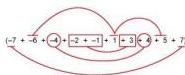
The average of these differences is , so the mean is .
Worked Example: Median, Mode, and Range
Find these values for: 2, 5, 4, 1, 0, 6, 4, 8, 6, 9, 3, 8, 7, 1, 8, 6.
First, order the 16 values: 0, 1, 1, 2, 3, 4, 4, 5, 6, 6, 6, 7, 8, 8, 8, 9. Median position: . The 8th value is 5 and the 9th is 6, so median = . Mode: There are three 6s and three 8s, so there are two modes: 6 and 8. Range: .
Grouped data: Modal class and estimates
Grouped data provides class intervals rather than specific numbers. Because exact values are unknown, statistics must be estimated.
- The modal class is the interval with the highest frequency.
- The range is estimated as the difference between the lower limit of the lowest interval and the higher limit of the highest interval.
- The mean estimate is calculated using the mid interval value () for each class. It is an estimate because it assumes a symmetric distribution within the classes.
- The median estimate is found by identifying the interval containing the th item and using linear interpolation.
Worked Example: Shopper Ages
A shopping centre records ages ():
| Age Interval | Frequency () | Mid-interval () | |
|---|---|---|---|
| 5 | 14.5 | 72.5 | |
| 10 | 24.5 | 245 | |
| 12 | 34.5 | 414 | |
| 18 | 44.5 | 801 | |
| 25 | 54.5 | 1362.5 | |
| 35 | 64.5 | 2257.5 | |
| 20 | 74.5 | 1490 |
Modal class: (frequency 35). Estimated Range: . Estimated Mean: Total . Total shoppers . Mean = , or 53 to the nearest year. Estimated Median: Position . Cumulative frequency reaches 45 before the class. The 63rd age is the th age in this group of 25. The estimate uses the rank of 17.5:

This gives 57.2, or 57 to the nearest year.
Advantages and disadvantages of summary data
- Mean: Includes every data value, but is heavily skewed by outliers.
- Mode: Can be used for non numerical data, but may fall at an extreme edge rather than the centre.
- Median: Not affected by outliers, but only usable for ordered data.
- Range: Shows the full spread, but is sensitive to extreme values.
- Interquartile Range (IQR): Measures the spread of the middle 50% (difference between upper quartile and lower quartile ). It is resistant to outliers but ignores 50% of the data.
Worked Example: Wage Distribution
A factory has 6 cleaners (£x), 36 machinists (£2x), 3 managers (£5x), and 1 owner (£50x). The mean is approximately £3.1x, which is unrepresentative of the majority who earn £2x. The median and mode (£2x) better represent the central trend. The IQR effectively shows the wage of the majority, while the range highlights the massive disparity created by the owner salary.
Graphical estimation: Cumulative frequency
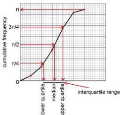
From a cumulative frequency graph:
- The median is found at frequency .
- Quartiles are found at (Lower Quartile) and (Upper Quartile).
- The modal class is the interval where the graph is steepest.
- The range is estimated from the horizontal spread of the curve.
Worked Example: History Test
For 70 students and a test out of 40:
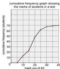
Median: At 35 students, the mark is approximately 17.5. Quartiles: (17.5 students) is 12.25 marks; (52.5 students) is 21.5 marks. .
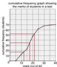
Mean Estimation: Divide the graph into intervals, find the mid intervals, and multiply by the frequency increase in each segment.
| Interval | Freq | Midpoint | F x Mid |
|---|---|---|---|
| 12 | 7.5 | 90 | |
| 11 | 12.5 | 137.5 | |
| 25 | 17.5 | 437.5 | |
| 14 | 22.5 | 315 | |
| 6 | 27.5 | 165 | |
| 1 | 32.5 | 32.5 | |
| 1 | 37.5 | 37.5 | |
| Total | 70 | 1215 |
Mean estimate = .
Graphical estimation: Histograms
In a histogram, frequency density is defined as . The area of the bar represents the frequency.
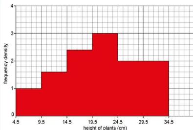
Worked Example: Plant Heights
Total number of plants: Sum of (frequency density width). .
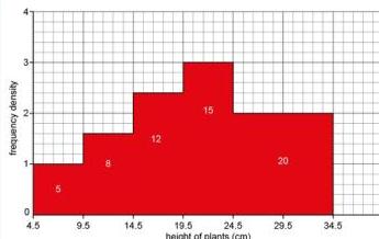
Mean estimate: . Modal class: The highest bar, . Median class: Position . Cumulative frequencies are 5, 13, 25, 40. The 30.5th item is in the class.
Using median and interquartile range to compare distributions
Comparing datasets involves looking at central tendency and spread like for like.
For example, when comparing two factories, Factory A (Range 4, IQR 2) and Factory B (Range 11, IQR 6), Factory A is more consistent because its measures of spread are smaller. If a buyer needs a consistent supply of at least 11 units, they would choose Factory A if its lower bound (Upper Quartile minus Range) is at least 11. Specifically, if Factory A has an Upper Quartile of 15 and a Range of 4, its minimum value is at least .
Key takeaways
- The mean, median, and mode are measures of central tendency, while range and interquartile range (IQR) describe the spread of data.
- Calculations for grouped data are always estimates because the individual raw data points are lost within the intervals.
- On a cumulative frequency graph, the modal class corresponds to the steepest section of the curve.
- In histograms, frequency is the area of the bar (frequency density multiplied by class width), not the height.
- When comparing distributions, use the median for a robust central measure and the IQR for a spread measure that resists outliers.
For the ESAT, if you are given a list of large numbers close together, pick a central 'guessed mean' and calculate the average of the differences to save time and reduce arithmetic errors.
Never calculate the range using frequencies. Always use the actual data values or the boundaries of the class intervals.
The gradient of a cumulative frequency graph at any point is equal to the frequency density of the data at that point. This provides a direct mathematical link between cumulative frequency curves and histograms.
Frequently asked questions
Why is the interquartile range often better than the range for comparing data?
The range is calculated using only the two most extreme values, meaning a single outlier can massively distort it. The interquartile range (IQR) measures the middle 50% of the data, providing a more reliable picture of the typical spread.
When must the mode be used instead of the mean or median?
The mode must be used for non numerical (categorical) data, such as favourite colours or car brands, where calculating a sum or ordering the data is impossible.
How do you find the modal class in a histogram if the class widths are different?
In a histogram, the modal class is the one with the highest frequency density (the tallest bar), which represents the highest concentration of data per unit width.