Statistical Tables and Charts for the ESAT
Updated July 2026
This guide teaches how to interpret and construct essential statistical representations for the ESAT. It covers categorical data using two-way tables, bar charts, and pie charts, alongside discrete numerical data and time series graphs. Mastering these methods ensures you can extract accurate information and identify trends from diverse data formats.
Data can be represented using tables or diagrams where visual elements, such as bar lengths, sector angles, or symbol counts, are mathematically proportional to the frequency of the data being described.
Two-Way Tables for Categorical Data
A two-way table uses rows and columns to create cells that show information relating to two different categories simultaneously. Each cell represents the intersection of a specific row and column.
For example: consider 20 pupils who were asked about their colour preference (red or blue) and their pet preference (cats or dogs). The results can be organised as follows:
| red | blue | |
|---|---|---|
| cat | 5 | 7 |
| dog | 4 | 4 |
From this table, we can see that 5 pupils prefer both red and cats. We can also calculate totals by adding across rows or down columns. The overall total is found where the total row and total column intersect.
| red | blue | Total | |
|---|---|---|---|
| cat | 5 | 7 | 12 |
| dog | 4 | 4 | 8 |
| Total | 9 | 11 | 20 |
Worked Example: Completing a Two-Way Table
There are 150 pupils in Year 10. They study either French or Spanish but not both. Use the information below to find how many girls study Spanish.
| French | Spanish | |
|---|---|---|
| boys | 42 | 37 |
| girls | 44 |
- Let the number of girls studying Spanish be .
- The sum of all students must equal 150: .
- Combine the known values: .
- Solve for : .
Frequency Tables for Categorical Data
A frequency table records the number of times a specific event occurs. It is common to use a tally chart during data collection, which is then totalled to give the frequency. This method helps summarise raw data into an organised format.
Worked Example: Ice Cream Tallies
80 students chose their favourite ice cream flavour. Complete the frequencies based on the following tallies. Note that a group of 5 is represented by 4 vertical strokes and a diagonal bar.
- Strawberry: 4 groups of 5 plus 2 singles = .
- Chocolate: 5 groups of 5 plus 1 single = .
- Vanilla: 2 groups of 5 plus 4 singles = .
- Banana: 3 groups of 5 plus 3 singles = .
Check: .
Bar Charts for Categorical Data
A bar chart uses bars where the length is proportional to the frequency. These can be drawn vertically or horizontally. There are three main types:
- Simple bar charts: Show the frequency of different categories.
- Grouped (dual) bar charts: Show data split further by source (for example, comparing boys and girls within each category).
- Stacked bar charts: Show subcategories within a single bar by splitting the bar into different segments by frequency.
Worked Example: Subject Preferences
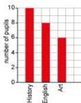
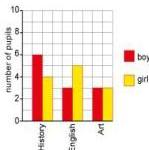
In a class of 24 pupils, 6 boys and 4 girls chose History: 3 boys and 5 girls chose English: 3 boys and 3 girls chose Art.
For a simple bar chart of totals: History is 10, English is 8, and Art is 6. Space is left between the bars for clarity.
For a dual bar chart: The bars for boys and girls are placed side by side for each subject, using a key to differentiate them.
Worked Example: Stacked Bar Chart Analysis
Using the chart below, find the difference in thousands of pounds between the annual sales of biscuits and crisps.
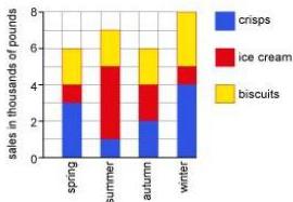
- Biscuits sales: thousand pounds.
- Crisps sales: thousand pounds.
- Difference: thousand pounds.
Pie Charts for Categorical Data
A pie chart is a circle where the angle of each sector is proportional to the frequency or proportion of that category. Total degrees in a circle is .
Worked Example: Car Colours
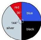
120 cars passed a gate. 40 percent were silver, 12 were red, were blue, and the rest were black. Calculate the angles and the number of black cars.
- Silver angle: .
- Red angle: of the cars. .
- Blue angle: .
- Black angle: .
- Black cars: of 120 cars = 30 cars.
Note: 3D pie charts should be avoided as the perspective distorts the front sectors, making them look larger than they are.
Pictograms for Categorical Data
A pictogram uses symbols to represent frequency. A key must be provided to define what one symbol represents.
Worked Example: Siblings Pictogram
60 students were surveyed. The pictogram uses triangles to represent the results.
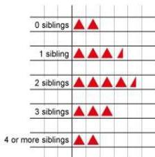
- Count the triangles: triangles.
- Find the value of one triangle: students.
- Students with 2 or more siblings: triangles. Total = students.
Vertical Line Charts for Discrete Numerical Data
Vertical line charts are used for ungrouped, discrete numerical data. Unlike bar charts, the lines have no width because the data exists only at specific points.
Worked Example: Test Marks
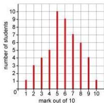
- Total students: .
- Students scoring 6 or more: .
Tables and Line Graphs for Time Series Data
Time series data tracks a variable over time (for example, monthly temperatures). While tables can store this, line graphs make patterns easier to see. Points are joined by straight lines (solid or dotted), and a trend line can be added to show general direction.
Worked Example: Ice Cream Sales Trend
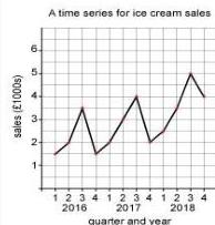
When drawing these graphs, time always goes on the horizontal axis. The scale must be linear and continuous. In the example above, while sales fluctuated between quarters, the overall trend from 2016 to 2018 was an increase.
Choosing an Appropriate Representation
Selecting the right chart depends on the data type and the purpose of the display:
- Large number of categories: Use frequency tables or vertical line graphs. Tables are easier for accurate reading, while lines are better for comparisons.
- Small number of categories: Bar charts, pictograms, and pie charts are effective visual tools.
- Subcategories: Use grouped or stacked bar charts.
- Data over time: Use tables or line graphs to identify trends.
Key takeaways
- In pie charts, the angle of a sector is calculated by .
- Vertical line charts are specifically for discrete numerical data and the lines should have no width.
- A pictogram is invalid without a key that defines the frequency represented by each symbol.
- Time series graphs must always place time on the horizontal axis using a linear, continuous scale.
Always check your totals when working with two-way tables or pie charts. For two-way tables, sum the internal cells to see if they match the row/column totals. For pie charts, ensure your calculated sector angles sum to exactly .
Do not confuse frequency with the data value itself. In a vertical line chart, the height of the line is the frequency, whereas the position on the horizontal axis is the numerical data value.
Statistical representations are the visual bridge between probability and data. For instance, the relative area of a sector in a pie chart directly represents the experimental probability of that category occurring if a data point were chosen at random.
Frequently asked questions
When should I use a grouped bar chart versus a stacked bar chart?
Use a grouped bar chart when you want to compare individual subcategories side-by-side (e.g., comparing boys' vs girls' scores). Use a stacked bar chart when the priority is showing the total frequency of a category while still illustrating its internal composition.
What is the main advantage of a line graph for time series data?
Line graphs allow for the quick identification of trends (upward, downward, or seasonal) which are often difficult to spot in a raw table of figures.
Why are 3D pie charts considered misleading?
The perspective and depth added to 3D charts distort the area of the sectors: sectors at the 'front' of the 3D image appear larger than they actually are relative to their frequency.