Scatter Graphs and Correlation for ESAT Mathematics
Updated July 2026
Master the interpretation of bivariate data using scatter graphs for the ESAT. This guide covers identifying types of correlation, drawing lines of best fit, and understanding the vital distinction between correlation and causation. Learn to accurately interpolate and extrapolate data while evaluating the reliability of these predictions.
Bivariate data involves two variables, where scatter graphs represent their relationship. Correlation measures the association between these variables, which can be modelled using a line of best fit for interpolation (predicting within the data range) or extrapolation (predicting outside it).
Understanding Bivariate Data and Scatter Graphs
Bivariate data is data involving two variables. Common examples include the height and weight of pupils in a class, or the daily growth of tomato plants alongside the number of umbrellas sold in a town. A scatter graph is the set of points plotted from a bivariate data set, used to visualise any association or relationship between the two variables.
When plotting these graphs, if one variable is believed to change in response to the other, we distinguish between them:
- The explanatory variable (the cause of variation) is placed on the horizontal axis.
- The response variable (the one that changes in response) is placed on the vertical axis.
For instance, if investigating how a pupil's height affects their weight, height is the explanatory variable on the horizontal axis. In cases where no clear cause and effect exists, such as comparing marks in two different subjects, the variables can be placed on either axis.
Types of Correlation
Correlation describes the relationship between two variables. Linear correlation refers to straight line relationships, while non-linear correlation occurs when data points form a curve.
When describing correlation, you must comment on:
- Direction: Whether the correlation is positive (both increase together) or negative (one increases as the other decreases).
- Strength: Whether the correlation is perfect, strong, weak, or non-existent.
Perfect positive correlation occurs when all points lie exactly on a straight line with a positive gradient.
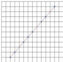
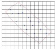
If the straight line has a negative gradient, it is a negative linear correlation. When points are not in a perfect line, drawing a rough rectangle around them helps determine strength: a narrower rectangle indicates stronger correlation.
Positive correlation:
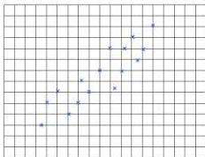
Weak positive correlation:
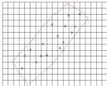
Strong positive correlation:
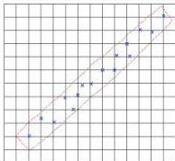
Negative correlation:
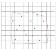
No correlation:
Correlation vs Causation
It is vital to understand that correlation does not indicate causation. A change in one variable does not necessarily cause the change in the other. The association might be due to a third variable affecting both, or it could be a spurious correlation occurring by chance.
For example, the growth of tomato plants and the number of umbrellas sold might show correlation, but plant growth does not cause umbrella sales: the common cause is the level of rain.
Estimated Lines of Best Fit
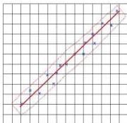
A line of best fit represents the general trend of the data. It should be drawn roughly parallel to the sides of the imaginary rectangle surrounding the points, with approximately equal numbers of points above and below the line. It does not need to pass through any specific points.
Interpolation and Extrapolation
These are methods for estimating values not present in the original data set:
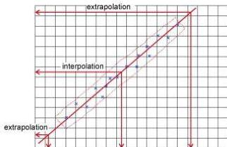
- Interpolation is estimating a value within the range of the given data. This is generally accurate because it follows the observed trend.
- Extrapolation is estimating a value outside the range of the given data by extending the line of best fit. This is dangerous because there is no evidence that the trend continues linearly beyond the observed data points.
Worked Example: Absence and Exam Marks
A teacher believes pupil absence affects test marks. She plots the marks against days of absence.
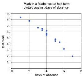
By drawing a rectangle around the points, we see it is narrow and slopes downwards, indicating strong negative correlation.
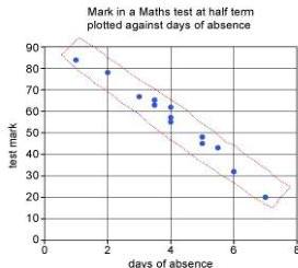
While this indicates an association, we cannot state that absence directly causes lower marks. Other factors like maths ability, illness, or nerves might be involved.
Worked Example: Physics and Chemistry Marks
The following table shows marks out of for pupils:
| Chemistry | |||||||||||||||
|---|---|---|---|---|---|---|---|---|---|---|---|---|---|---|---|
| Physics |
We plot Chemistry on the horizontal axis as the marks are already ordered.
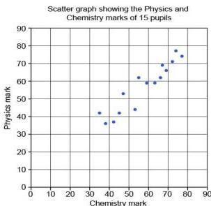
The rectangle shows positive correlation. We draw the line of best fit through the middle of the trend.
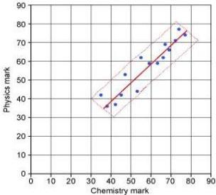
Task 1: Estimate Physics mark for Chemistry . We draw a line up from on the horizontal axis to the line of best fit, then across to the vertical axis. The estimate is approximately . This is interpolation and is likely reasonable, though it doesn't account for individual variation in subject ability.
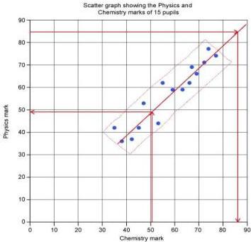
Task 2: Estimate Chemistry mark for Physics . We extend the line of best fit to reach a height of . The corresponding Chemistry mark is approximately . This is extrapolation. It is less reliable because we have no guarantee the trend continues outside the to range.
Key takeaways
- Bivariate data involves two variables: the explanatory variable goes on the x-axis and the response variable on the y-axis.
- Correlation measures the direction (positive/negative) and strength (perfect to none) of the relationship, but does not imply causation.
- A line of best fit should have an equal distribution of points above and below it, following the central trend of the data.
- Interpolation (estimating within the data range) is generally reliable, whereas extrapolation (estimating outside the range) is risky as trends may change.
When drawing a line of best fit by eye, imagine a thin rectangle encompassing the data points. Draw your line through the centre of this rectangle, ensuring it is parallel to the longer sides.
Never use the word 'cause' when describing correlation in an exam unless you have specific evidence of a mechanism. Stick to terms like 'association' or 'relationship'.
While the ESAT focuses on 'estimated' lines of best fit, in advanced statistics, the 'least squares regression line' is used to mathematically minimise the squares of the vertical distances between the points and the line.
Frequently asked questions
How do I decide which variable goes on which axis if there is no clear cause?
In cases where there is no clear explanatory or response variable, such as comparing scores in two different subjects like English and History, you may place the variables on either axis. The resulting correlation will remain the same.
What is a 'spurious correlation'?
A spurious correlation is a relationship where two variables appear to be related, but are actually independent of each other. The correlation may happen purely by chance or because both variables are influenced by a hidden third factor.
Why is extrapolation considered dangerous in statistics?
Extrapolation assumes that the observed linear trend continues indefinitely. In reality, the relationship might become non-linear, reach a limit, or change direction entirely outside the measured data range, making predictions highly unreliable.